Albert Munsell
Albert Henry Munsell (6 January 1858 – 28 June 1918) was an American painter, teacher of art, and the inventor of the Munsell color system.
He was born in Boston, Massachusetts, attended and served on the faculty of Massachusetts College of Art, and died in nearby Brookline.
As a painter, he was noted for seascapes and portraits.
Munsell is famous for inventing the Munsell color system, an early attempt at creating an accurate system for numerically describing colors. He wrote three books about it: A Color Notation (1905), Atlas of the Munsell Color System (1915) and one published posthumously, A Grammar of Color: Arrangements of Strathmore Papers in a Variety of Printed Color Combinations According to The Munsell Color System (1921). The Munsell color order system has gained international acceptance and has served as the foundation for many other color order systems, including CIELAB. In 1917, he founded the Munsell Color Company.
http://en.wikipedia.org/wiki/Albert_Henry_Munsell


The Munsell color system is a color space that specifies colors based on three color dimensions, hue, value (lightness), and chroma (color purity or colorfulness).
Hue:
Each horizontal circle Munsell divided into five principal hues: Red, Yellow, Green, Blue, and Purple, along with 5 intermediate hues halfway between adjacent principal hues. Each of these 10 steps is then broken into 10 sub-steps, so that 100 hues are given integer values. Two colors of equal value and chroma, on opposite sides of a hue circle, are complementary colors, and mix additively to the neutral gray of the same value. The diagram below shows 40 evenly-spaced Munsell hues, with complements vertically aligned.
Value:
Value, or lightness, varies vertically along the color solid, from black (value 0) at the bottom, to white (value 10) at the top.[5] Neutral grays lie along the vertical axis between black and white.
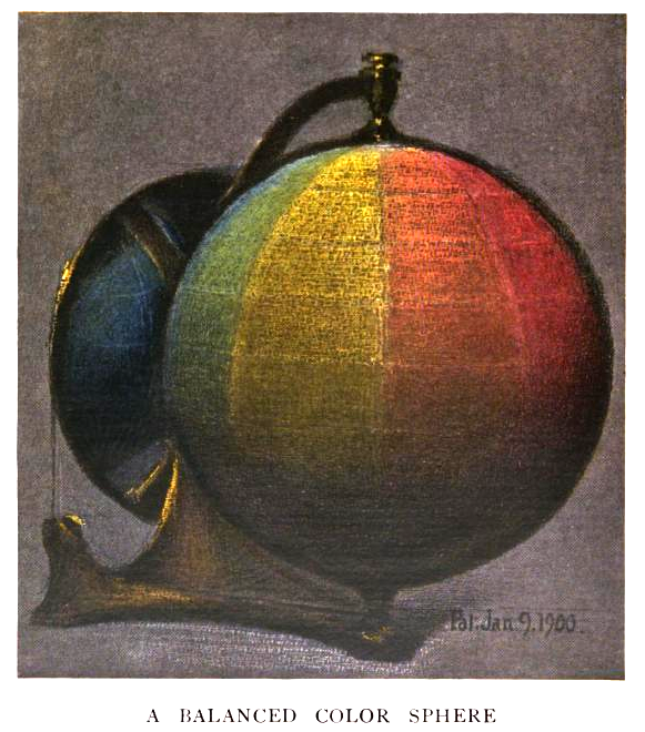
Several color solids before Munsell’s plotted luminosity from black on the bottom to white on the top, with a gray gradient between them, but these systems neglected to keep perceptual lightness constant across horizontal slices. Instead, they plotted fully-saturated yellow (light), and fully saturated blue and purple (dark) along the equator.
Chroma:
Chroma, measured radially from the center of each slice, represents the “purity” of a color, with lower chroma being less pure (more washed out, as in pastels). Note that there is no intrinsic upper limit to chroma. Different areas of the color space have different maximal chroma coordinates. For instance light yellow colors have considerably more potential chroma than light purples, due to the nature of the eye and the physics of color stimuli. This led to a wide range of possible chroma levels—up to the high 30s for some hue–value combinations (though it is difficult or impossible to make physical objects in colors of such high chromas, and they cannot be reproduced on current computer displays).
Specifying a color:
A color is fully specified by listing the three numbers for hue, value, and chroma. For instance, a fairly saturated purple of medium lightness would be 5P 5/10 with 5P meaning the color in the middle of the purple hue band, 5/ meaning medium lightness, and a chroma of 10.

COLOR WHEEL:

The function of Value is to tell us how light or how dark a given color is. For this purpose we shall need a scale of Value, which we may conceive as a vertical pole, or axis, to our circle of Hues. Black is at the lower end, representing total absence of light. White is at the top, representing pure light. Between these are a number of divisions of gray, regularly graded between black and white. This gradation could also be infinite. Since pure black is unattainable, we will call that 0 and begin our scale with the darkest gray as 1, numbering the steps up to 9, which is the lightest gray. Pure white, which is also unattainable, we will call 10. In the practical use of the scale of Value, therefore, we shall have but 9 steps and the middle one of these will be 5 - what is referred to as Middle Value. These steps of Value, have been scientifically measured and registered by means of an instrument called a Photometer (an instrument used to measure illuminance or irradiance).
http://www.applepainter.com/Chap02/index.php

The pole represents a neutral axis to all the circle of Hues and in itself has no color, but is pure gray. Around this pole we may place our band representing the scale of Hue. Then if we imagine any one of these Hues on the circumference of the band to grow inward toward the gray pole in the center, growing grayer or weaker in color strength until it reaches this center pole and loses its color entirely, we have grasped the idea of the dimension known as Chroma. By dividing this into regular measured steps, we have a scale upon which the strength of color may be measured. This dimension of Chroma is written in a color formula by means of a numeral below a line. The numeral denotes the step upon the Chroma color scale at which it falls, thus /5, /8, /9, etc.
http://www.applepainter.com/Chap03/index.php

COMPLEMENTARY COLORS are across from eachother on the color wheel.
When any two colors are truly opposite (at the point of strongest contrast), their admixture will produce a perfectly neutral gray.

For example:


These three different brands of mascara use the three major complimentary color schemes to attract customers.

1 Comments:
We enjoyed reading your post. Very thorough! Kudos.
Post a Comment
Subscribe to Post Comments [Atom]
<< Home